Javlo support
  • Home
  • The interface
  • Structure of a page
  • The contents
  • Text components
  • Files and media

Javlo "Quick Start": the basics

This guide will provide basic knowledge about Javlo 2. It introduces you to the basic operations you can perform, such as creating, editing, moving and deleting content, organising the structure of the website, adding interactive features and posting your changes.

Javlo "Quick Start": the basics


The interface

The interface consists, at the top to perform the basic actions:

  • home: back to the root page of the site
  • delete: deletes the current page
  • preview: disables the editing of the site and allows to see the site as it will be published
  • undo: cancels the last simple action
  • publish: publish content edit
  • info: displays the notes on the editorial and technical validation of the page.
  • edit mode: returns to the "edit mode"
  • edit user: edits the current user's data 
  • logout

On the left, there  are 4 separate areas in tabs:

  • Navigation: navigation of the site, it is possible to add a page at the bottom, the button "+" allows to add a page by letting the system choose the name of the page.
  • Commands: changes the template to access the properties of the page and execute the macros.
  • Content: Contains the list of components, ie the elements that can be placed on the page.
  • Resources: Accesses to static resources (image, file, sound ...) and place it on the page in "drag and drop ».
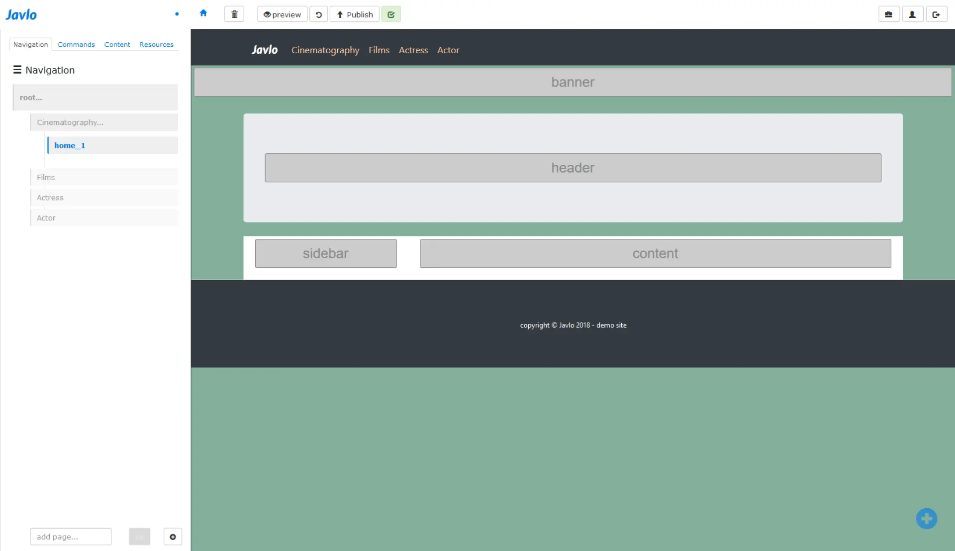
Javlo: content editing interface (preview mode)
 

Structure of a page

A page is divided into "areas". They may contain "components » i.e. content. The number and layout of "areas" may vary from one template to another, but all pages have at least one "area" "content".

Javlo: one-page structure (4 areas: banner, header, sidebar and content)
 

The contents

Each element of the content can be modified by clicking on it. Each of these elements can be moved from one area to another or moved within the same area. For this you just have to use the "drag and drop".

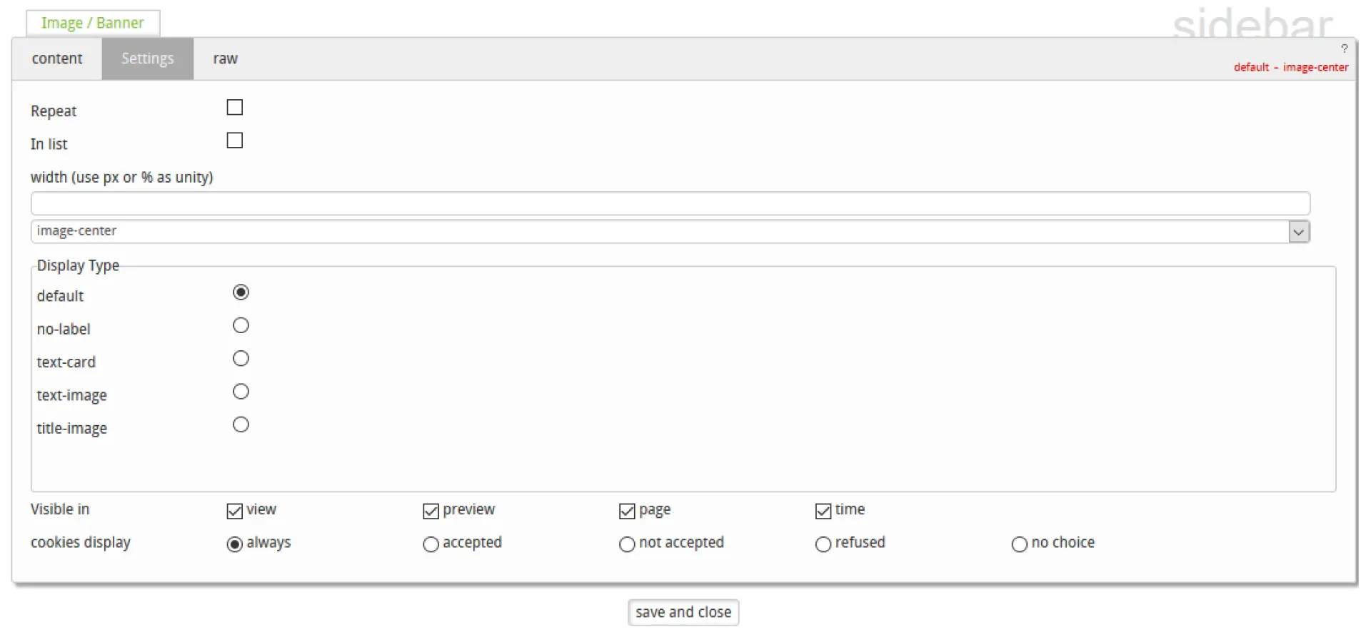
Each component contains a 'settings' tab that allows you to configure the component in a generic way.

  • Repeat: displays the component on all the girls pages
  • In list: displays the component in a list
  • Display type: to choose the "renderer » i.e. the way the component will be displayed


Javlo: component configuration
 

Text components

Heading

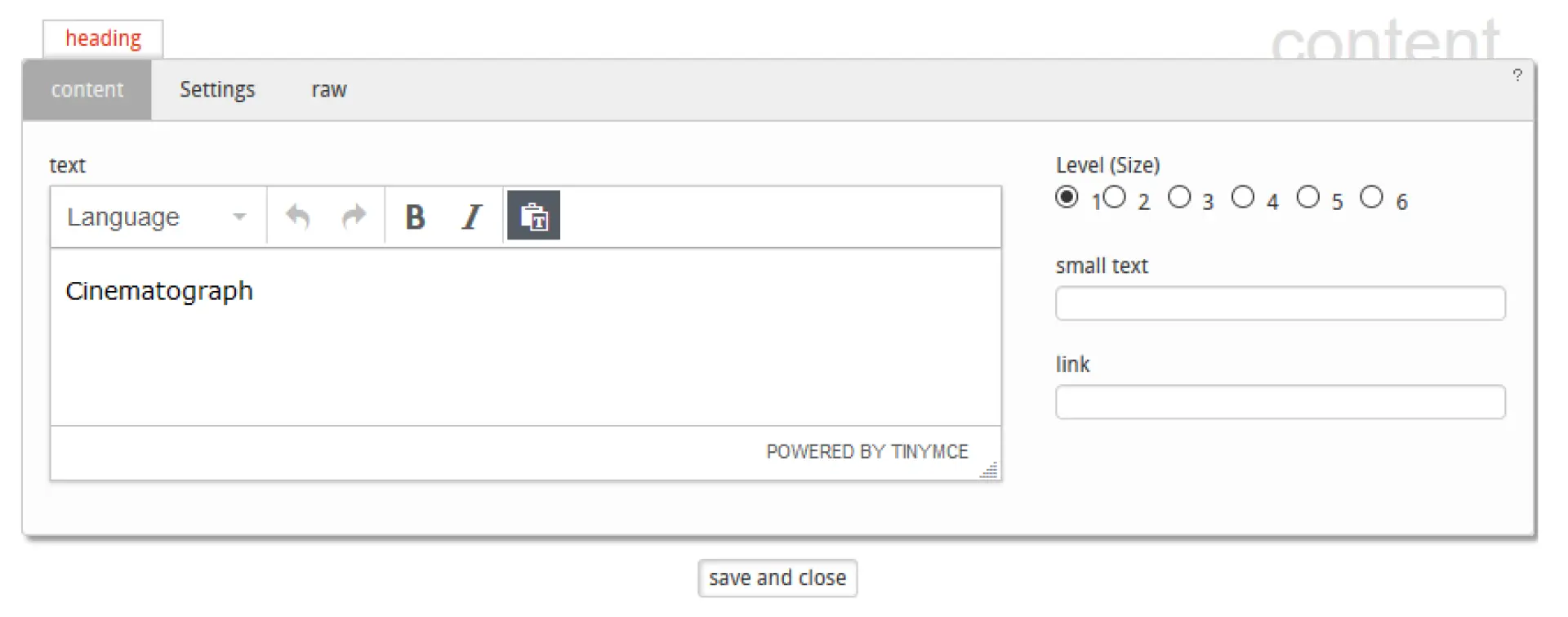
Titles can have 6 levels (HTML correspondence: H1… H6). The title of level 1 is the default title of the page and is used to build the URL in most "factory URLs."

Titles can have 6 levels (HTML correspondence: H1… H6). The title of level 1 is the default title of the page and is used to build the URL in most "factory URLs."

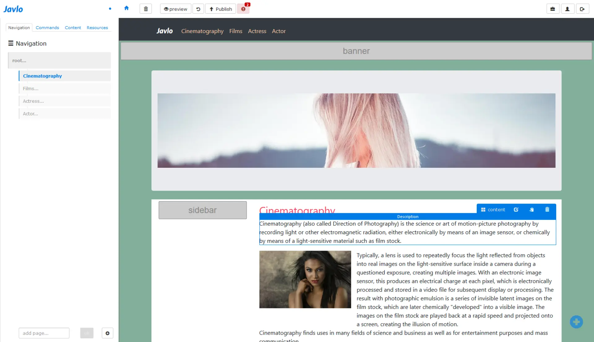
Description

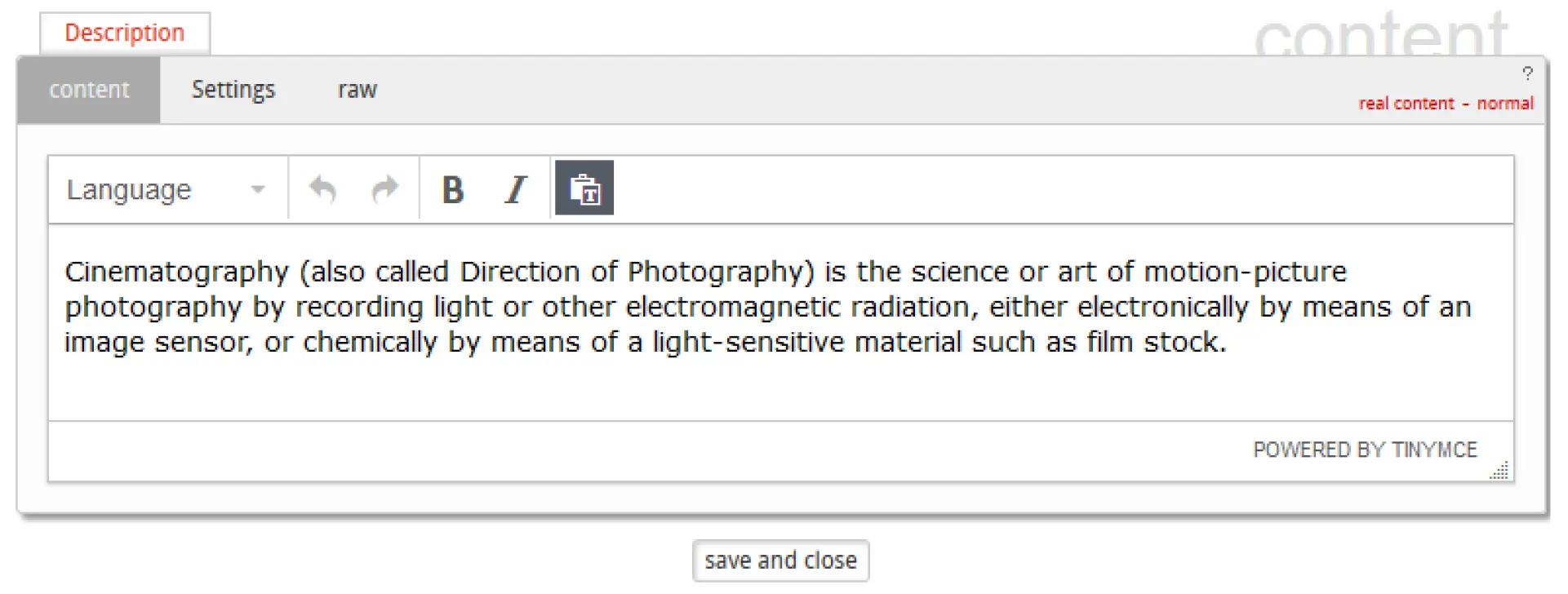
The "description" component corresponds to the meta html description. This space is used to describe in a few lines what the page contains. This corresponds to the "blurb" as it is called in copywriting. The text can be displayed or not (tab "settings") the content of this component is used to fill the meta description tag that plays an important part in SEO.
 

The "description" component corresponds to the meta html description. This space is used to describe in a few lines what the page contains. This corresponds to the "blurb" as it is called in copywriting. The text can be displayed or not (tab "settings") the content of this component is used to fill the meta description tag that plays an important part in SEO.


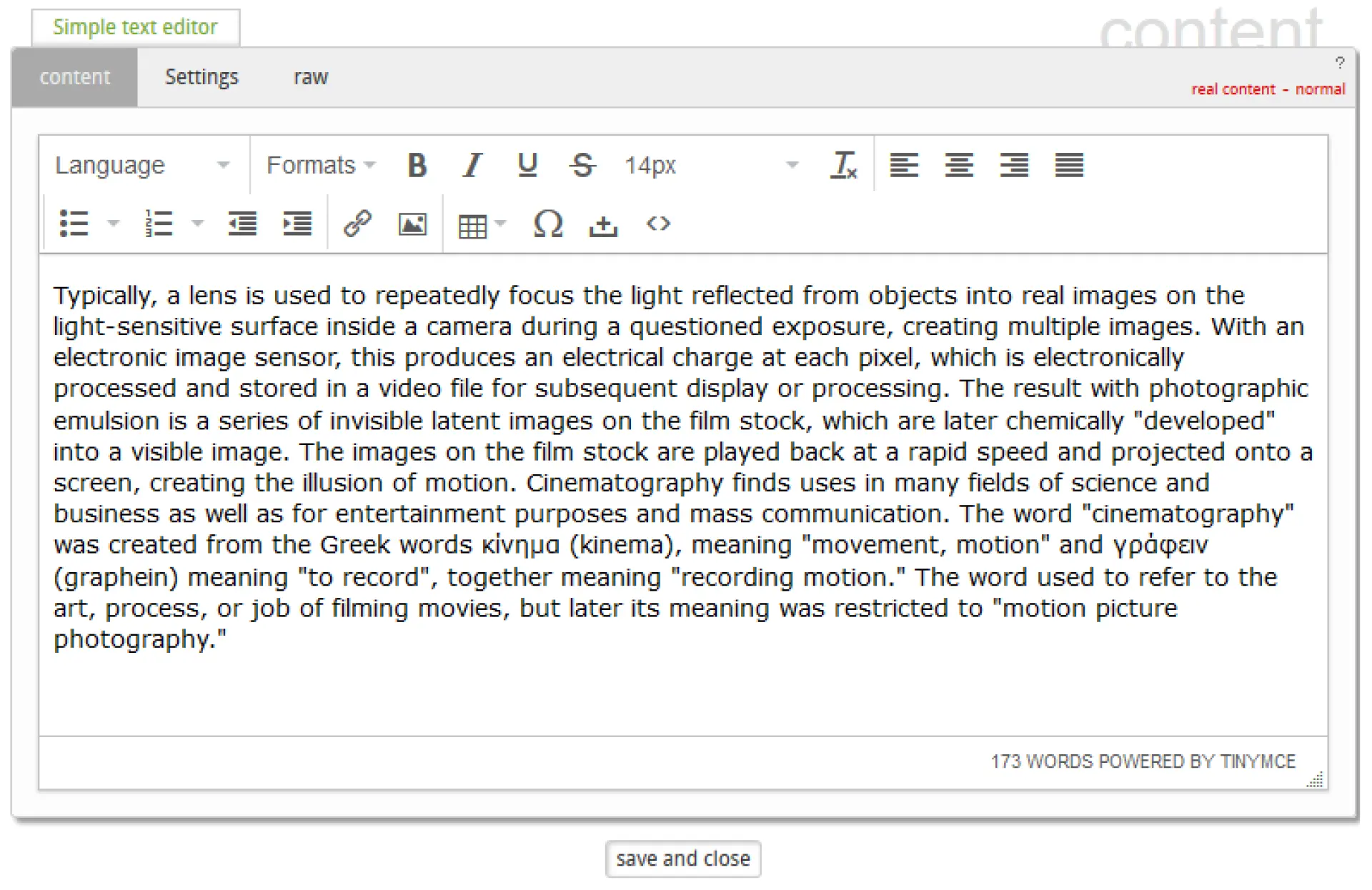
Simple text editor

The "simple text editor" allows to add a text and to put it in page: 

choice of the language of a subtext of the text (important for accessibility)
formats: to divide the title content
B I U S: Bold, Italic, Underline, bar
font size
remove formatting
text alignment: left, centered, right or justified
list chip
numeric list
create indentations
create a link
add an image
add a table
add a special character
add inscribed space
show HTML code

The "simple text editor" allows to add a text and to put it in page: 

  • choice of the language of a subtext of the text (important for accessibility)
  • formats: to divide the title content
  • B I U S: Bold, Italic, Underline, bar
  • font size
  • remove formatting
  • text alignment: left, centered, right or justified
  • list chip
  • numeric list
  • create indentations
  • create a link
  • add an image
  • add a table
  • add a special character
  • add inscribed space
  • show HTML code
 

Files and media

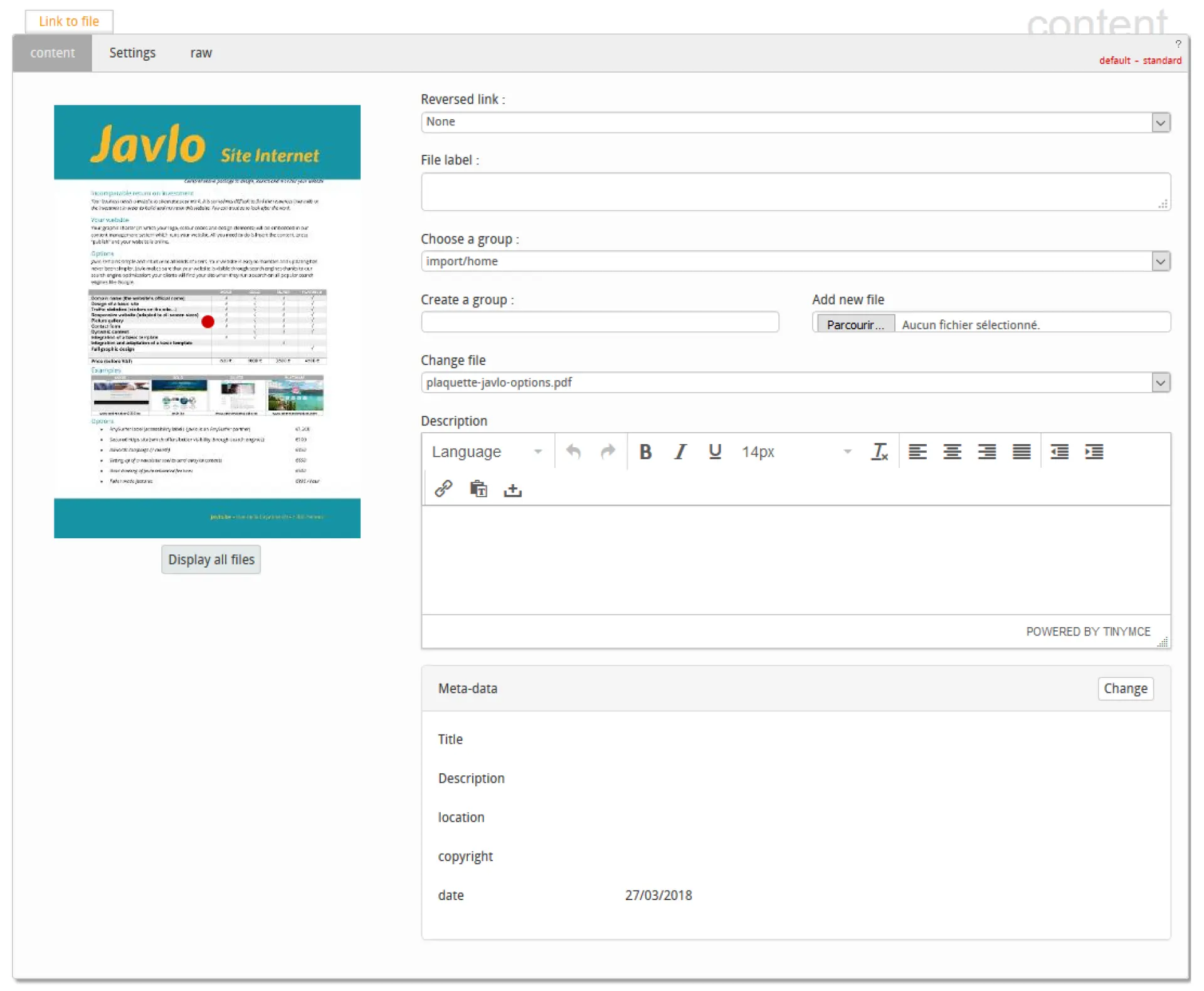
Link to file

The left part contains a preview of the file while the right part allows to configure the component:

reversed link: allow to create a reverse-link to the file.
File label: file label, is used for the reverse-link.
Choose a group: allow to select the directory where the file is located.
Create a group: allows you to create a directory in the current directory.
Change file: allows you to select the file by name (it is also possible to select it in the preview by clicking on "Display all files".
Description: File description
Meta-data: Each resource contains a certain number of data. It is possible to edit them directly via the component.

The left part contains a preview of the file while the right part allows to configure the component:

  • reversed link: allow to create a reverse-link to the file.
  • File label: file label, is used for the reverse-link.
  • Choose a group: allow to select the directory where the file is located.
  • Create a group: allows you to create a directory in the current directory.
  • Change file: allows you to select the file by name (it is also possible to select it in the preview by clicking on "Display all files".
  • Description: File description
  • Meta-data: Each resource contains a certain number of data. It is possible to edit them directly via the component.

Global image

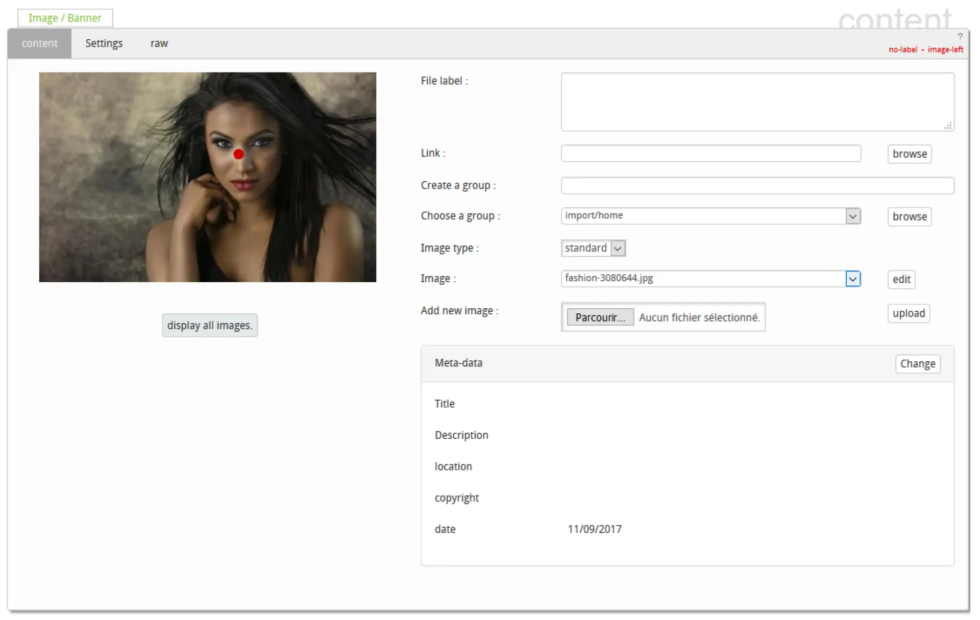
Image / Banner allows you to place an image. The component is similar to the "Link to File" component. & nbsp; It is still possible to create a link on an image via the "link » field. If this field contains, nothing the link will be towards the image itself, if this field contains the character "#" there will be no link.
"Image type" allows to apply a filter & agrave; the image (defined in the template), if this filter does not have the same proportions of the image, it is preferable to locate the point of interest so that the framing is done at best.
 

Image / Banner allows you to place an image. The component is similar to the "Link to File" component. & nbsp; It is still possible to create a link on an image via the "link » field. If this field contains, nothing the link will be towards the image itself, if this field contains the character "#" there will be no link.

"Image type" allows to apply a filter & agrave; the image (defined in the template), if this filter does not have the same proportions of the image, it is preferable to locate the point of interest so that the framing is done at best.


Multimedia

Multimedia: allows you to display image galleries.

title: gives title of the gallery
choice of directory: to browse in the directory containing the images
date range: display images on a given date
list size: limits the number of images
page size: defines page size when paginated
order: changes the order in which images are displayed
 

Multimedia: allows you to display image galleries.

  • title: gives title of the gallery
  • choice of directory: to browse in the directory containing the images
  • date range: display images on a given date
  • list size: limits the number of images
  • page size: defines page size when paginated
  • order: changes the order in which images are displayed